Posts

Showing posts from February, 2020

Title font options

Image
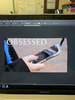
Today I have been playing around with adobe photoshop, trying to get familiar with how to use it. I thought whilst trialling out how it all works I could look into what font styles I could use for my poster, and possibly thought all my media texts for my documentary as having the same fonts will enable all my media texts to create a sort of house style throughout.  I think in the end of trailing some of these fonts out I ended up liking the font which was named 'century gothic.'

Looking into posters of other documentaries

Image
I have been looking into BBC posters for documentaries in-particular as I am doing my documentary for BBC Three and so I want to get the same sort of way that they have there own posters. Most of these BBC posters are quite simple, with the titles of the documentary and the 'BBC II!' sign which I think I will need to have in my poster. Another thing I have noticed in these documentary poster which is different to other documentary posters like the one below is that on BBC three the majority of the posters are done landscape whereas normally poster are portrait like this one: I think I will experiment with both landscape and portrait as portrait is what is commonly used for a poster but then again I have planned for my documentary to be on for a BBC three audience and so in some ways the poster should be how people would except a BBC three poster to be. I did find this poster however of Jesy Nelsons 'odd one out' so I could do a portrait poster. 

Music options

Image
I have a few times in which I will need music, in the introduction as I have my VoiceOver, then throughout all of the ending I want music to run through. Here are some options of what I am thinking to use: https://www.youtube.com/watch?v=Unr1Up08yyU  - I think this is good for particularly the beginning of my documentary where I have a voice, but it may be a bit too intense, and quick. https://www.youtube.com/watch?v=veHqJSC-9Lo  - I also quite like this song, as it is known people may respond better to my documentary and want to watch it. https://www.youtube.com/watch?v=IDgR3FNlsUM  - Again I like this song however down know if it is best suited to the documentary as it is quite heavy and I I wouldn't want to begin with this.  https://www.youtube.com/watch?v=m6Sg3NkHG9U  - I personally love this song however it seems to be an uplifting song at times and so may not fit well with what is being said.  https://www.youtube.com/watch?v=0J_z7RjLZfo  - I like this so

My process of editing it all together

In this video I am making a start to the editing to all my clips and making it all come together. Now I just need add the music and voice over, and possibly add more things in my editing to make it more interesting and look more advanced. 

Interviewing an assistant psychologist

Image
I thought for this interview that I would have a pure white background as I want to attention from the audience to be about what she is saying. I also asked if she could wear her NHS badge to show she works for the NHS. When filming I had a few problems with the videos taking up storage on the SD cards, but I luckily had a backup one. Once I had filmed I put all the videos on my laptop and it ended up to be 28 minutes worth of editing! So I sat down and edited this footage right down to what I felt was the most key things that were said. It ended being 2 minutes and 40 seconds. I know this might be quite long but I feel as though what she is saying is interesting and important in looking at the topic of social media.

Filming in a city

Image
I went to Cardiff with my sister and brother so that I could get shots of them on their phones throughout the day in different places emphasising the idea of how much social media is used day to day in peoples normal lives. I also had my brother in some shots to show a range of genders which I needed to improve from my preliminary. So here I have put together some clips from my day out in Cardiff. 

My structure

Image

New idea

Image
Click here for slideshare

Interviewing

Image
Last night I had the chance to film my younger cousin for the documentary, this was lucky as I didn’t know if I could see her anytime soon. As I was filming her I though I would also ask my grandad if I could film him as i thought the setup was quite nice. One problem with the footage of my Grandad however was that his glasses were reflecting the light in which I had setup, although it’s annoying I think it will be okay. I chose to film my Grandad so that I had the choice of who I want to edit into my final production. Either my teacher who was in my first draft, or my grandad. For this filming I have selected the most relevant best questions I thought. As one thing I need to do better from my first draft was to decide more on the narrative and so I tried to make the questions more about social media rather than more on phones. After looking into the footage of my Grandad I decided to re film his interview. So I chose a different setting and used natural lighting,

Casting for VoiceOver

Image
As I am going to have a VoiceOver in my documentary I really wanted to find the perfect voice to do this. I found that the girl I used for my preliminary was a slightly rushed choice of person and so I want to experiment with different people and different voices.  I gave each person the line to say; "People are becoming obsessed with phones" I asked a range of people, boys/girls, old/young. I think my next stages now will be to create a script for whoever I end up having as my VoiceOver.