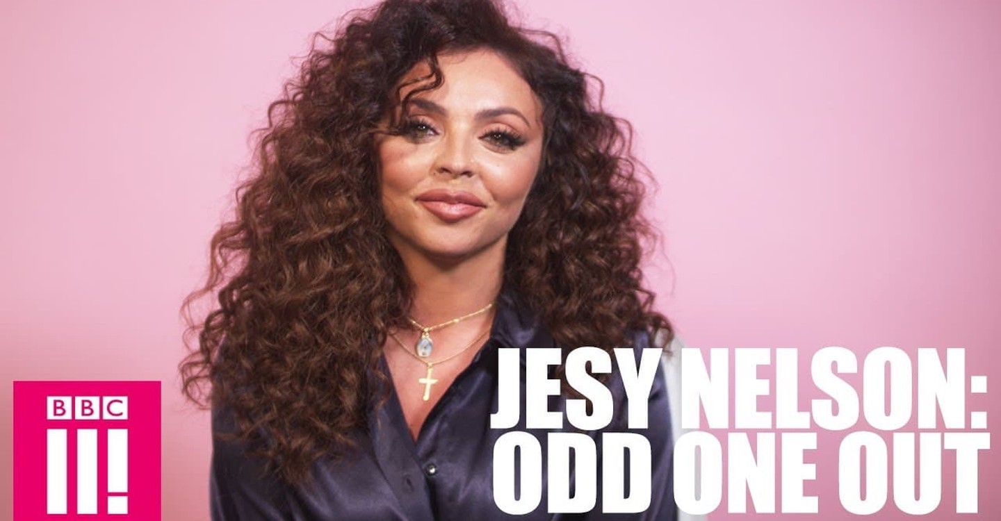
Colour palette for the BBC Three
Looking at the colour palette here the colours are very natural, bright colours, similar to my documentary I am talking about social media and so they have a picture of someones social media on the poster which immediately tells the audience what the documentary is about.

The text that I have chosen in many of my poster drafts is the same font as this one in Jesy Nelsons documentary. I really liked this font as I thought it suited my style of documentary. the colours I think are even more simple for Jesy Nelsons documentary with a pink background and then this created pink outlines around her hair. I think this is done because the central focus of this particular documentary is of her.

Stacey Dooleys poster for her documentary seems to be a snapshot of her talking most probably in her documentary and so you are again seeing exactly what sort of things she will be discussing in her documentary. The colour palette again natural tones, not much editing.

Comments
Post a Comment